Back To School Tees #6 Central High Wildcats

Posted by Mongo

It’s the sport of Kings. Better than diamond rings.
Football.


Allow me to beatbox now. Kidding. Way back in 1986, a year after the Chicago Bears shellacked the New England Patriots in Super Bowl XX, a little film about a rundown high school with a crappy football team made a dent in the defensive line of pop culture with a Super Bowl Shuffle-esque rap over the closing credits and scored big. Not that anyone truly remembers Wildcats as a film on par with Remember The Titans or North Dallas Forty, but walk up to anybody old enough to remember the 80s and say, “Football” in a rather airy falsetto voice and they’ll know exactly what you are talking about, Willis. Goldie Hawn proved a force to be reckoned with in the company of Wesley Snipes, Woody Harrelson, and Mykelti Williamson as she strode into a locker room full of half naked… and some all naked players and took coaching by the balls. So, I give you number six on the "Pop Culture Back To School Tour," Central High’s Wildcats.


Football.


Central High Wildcats
Value white tee from CafePress for $11.99

American Apparel Unisex Long Sleeve from Skreened for $22.99

Women’s Dark T-Shirt from CafePress for $24.99


Fun Facts About The Movie
First credited films for Woody Harrelson and Wesley Snipes, who would go on to team up in two more movies, White Men Can’t Jump and Money Train.


There is an interesting goof that takes place as Woody Harrelson’s character gets demoted to slot back. In his new position, he makes a great run, only the person doing the running isn’t Harrelson, he’s not even white. Yet, after the tackle, a very white Woody Harrelson stands up with the ball.

  Wildcats Rap

Back To School Tees #5 Miskatonic Medical School

Posted by Mongo

For the number five school on our "Pop Culture Back To School Tour" we've decided to concentrate on a specific discipline, namely medicine.   This 80s tale of reanimating the dead was inspired by the works of H. P. Lovecraft.  Re-Animator became a cult film spawning two sequels and a cult following.  That following led me to create a design for the Miskatonic Medical School of Arkham Massachusetts.  And now, it's available for you and all your devilish intentions.


Miskatonic Medical School
Get a Jr. Spaghetti Tank at CafePress for $19.99


Get an Anvil Unisex Heavyweight Ringer Tee at Skreened for $20.99


Get a Basic Dark Shirt at Zazzle for $25.85


Fun Facts About The Movie
25 gallons of fake blood were used throughout the film.


The first body to be reanimated at the morgue was Arnold Schwarzenegger's stunt double.


James Cameron's father makes a cameo in the film as man with his jaw bandaged up.

Back To School Tees #4 Thomspon High Warriors

Posted by Mongo

Let’s take it to the mat for number four of the Pop Culture Back To School Tour. We head into the Pacific Northwest on a Vision Quest. As far as sports movies go, there are not too many out there that have to deal with the sport of wrestling and I don’t mean the WWE. I’m talking about high school wrestling. Vision Quest gives you a portrait of a high school athlete that goes against man and nature to complete some kind of quest to find some meaning in his life. Dude, your 18. Mellow a bit.


Anyway, Louden Swain decides to drop into a different weight class to wrestle three time state champion, Brian Shute. In doing so, he alienates his teammates, experiences health problems, and falls in love with an artist who stays with the Swains on her way through to San Francisco. Along with being an 80s classic, the movie boasts some great music including Journey’s "Only the Young", Red Rider’s "Lunatic Fringe" and Madonna’s "Crazy For You", which she performs in the movie as a club singer.


Shout to the top as you lug a tree trunk up and down stadium steps while wearing a Vision Quest inspired Thompson High School Warriors tee.


Thompson High School Warriors

Get it on an Anvil Unisex Heavyweight Ringer Tee from Skreened for $20.99


Get it in red with a black design from CafePress for $23.99


Get it in on EDUN LIVE Eve Ladies Essential Crew shirt from Zazzle for $28.10


Fun Facts About the Movie
Frank Jasper, who plays Brian Shute, did very little acting after Vision Quest. IMDB lists only three credits including Brian Shute. However, Jasper did reprise or spoof his pop culture claim to fame by appearing in the video for Van Halen’s "Right Now" holding a cardboard sign that says, “I Will Wrestle You For Food.”   Look at 1:10 on the video.

Back To School Tees #3 Calumet Wolverines

Posted by Mongo

Next we take a tour of the snowy and rocky terrain of Colorado on our Pop Culture Back To School Tour. In 1984, America was invaded by Communist forces and a small band of teenagers and their twenty-something leader fled into the hills of Calumet. Eventually, they became a guerilla force known as the Wolverines which was based on their school mascot and begin to execute attacks on the occupation forces. This, of course, is all a part of the movie Red Dawn. In the waning days of the Cold War various films came out speculating the events of World War III, including Amerika, The Day After, and Miracle Mile. But none were as well received as Red Dawn. It became a pop culture mainstay due to its timing and the cast of future stars like Charlie Sheen, Patrick Swayze, and Jennifer Grey. You can usually find various websites offering shirts based on the Wolverines graffiti logo in the film, but since this is a series about schools in pop culture I went for the school logo which is briefly visible on the scoreboard and the varsity jackets of the cast in the opening minutes of the film. So, I give you the Red Dawn inspired Wolverines logo.


Calumet Wolverines
 
Ash Grey Light shirt from CafePress for $17.99


Unisex Fitted White shirt from Skreened for $19.99


Dark Blue Women's shirt from
Zazzle for $30.35


Fun Facts About the Film
The Flamingo Kid was the first film to receive the rating of PG-13 but Red Dawn was the first film to be released in the US with the newly adopted rating.

The film was entered into the Guinness Book of World Records for having the most acts of violence in any film up to that time.

Back To School Tees #2 Adams College

Posted by Mongo

Continuing our lineup of “Back To School Tees” we head out to the left coast to Adams College, home of the Alpha Betas, The Tri Lambs, and Ogre. The progenitor of god knows how many subpar sequels, Revenge of the Nerds gave the underdog a chance to be king of the campus. They defeated the Jock Frat Boys by using their brains over their brawn, which, if they had pulled half of that stuff now, they would have surely been arrested for sexual harassment, breaking and entering, and probably drug charges. But it was the 80s, a simpler time when all of these types of infractions would have been met with a slap on the wrist and a pat on the head for being “college boys.”   So, here's the Adams College Home of the Atoms logo for you.

Adams Atoms
Get it at Skreened on a baseball tee for $28.99

Or a regular white tee for $19.99

Fun Facts About The Movie
Robert Carradine and Anthony Edwards tested out their nerd makeup and costumes by rushing an actual fraternity during college rush-week. The leader of the first house they rushed took one look at them and said, “No way!”

Donald Gibb (Ogre) is dressed as a Viking for the homecoming carnival. Nowadays he plays what looks to be one in the Captial One credit card commercials.

Lewis Skolnick’s nerd laugh was actually inspired by his on screen dad, played by James Cromwell. “That’ll do nerd, That’ll do.”

Back To School Tees #1 Grand Lakes University

Posted by Mongo

It’s that time, again. Time to get out the Trapper Keepers and pencil boxes. Here at Mongo Angry! Mongo Smash! we are revisiting the schools of Pop Culture by bringing you a different tee every day until… I get lazy or forget. First up, let’s head out to fictional Grand Lakes University for some Dylan Thomas and Triple Lindys with Back To School.


From Skreened, a plain white tee
with the Grand Lakes University logo, starting at $19.99.
You can choose from different styles and colors in my store at Skreened.

From Zazzle, women's red long sleeve shirt
with the logo in white, for $30.35
Get this Back To School themed design on other products
from my
Zazzle store.

 
Finally, at CafePress, a long sleever baseball tee for $21.99
Get this Back To School themed design on other products from my CafePress Store.


Fun Facts About The Movie
The room that Thornton Melon takes his final exam in is the same room that Alex Owens performs her audition in for the movie Flashdance


There’s a song playing at the frat party just before everyone bolts for Mellon’s. That song is from a little known metal singer who became better known for his long locked, easy listening phase in the late 80s, early 90s. It’s that no talent ass clown Michael Bolton.


This movie completes the Awesome 80s Bully Trilogy for William Zabka who also played the jock/bully in The Karate Kid and Just One of the Guys. And yes, I made up the Awesome 80s Bully Trilogy just now. Get over it. Grrr. All hail William Zabka!


Mongo is Angry! Grrr!

Posted by Mongo

This past weekend my wife’s niece and her niece’s older sister spent a couple of days at Chez Mongo. I was a bit out of my element as I was the only male in a household of four girls and three female cats. The only other male in the house was my other cat, Oscar, and he’s neutered. There’s not much machismo to be had there.

Anyway, throughout the weekend, the houseguests would frequently use the word “Grrr” for anything and everything. I began to think, “Hey, wait a minute, that’s my line. I’m the angry one here.” To be honest, I may be a little cantankerous from time to time, but I wouldn’t classify myself as full on angry. Still, I found it a little humorous since my online persona is described as someone that would use that exclamation for just about everything, in my house, that doesn’t work. Then it struck me that I haven’t done an honest to goodness Mongo design in a while. So, I had to strike while the inspiration was there.


Grrr!

Get it at Skreened, Zazzle, and CafePress
on a variety of products.

Achieving the Effect
I decided to use one of my favorite tools, Microsoft Word Art, to achieve the wavy text effect as if the word “Grrr” was just escaping the grinding of Mongo’s teeth. I copied and pasted that text into a blank layer in my editing application, Paint.NET and then duplicated the text onto two more layers.

I lassoed and moved the middle and bottom layers slightly in a downward angle to create a shadowed effect to add some depth. I inverted the middle layer into a white color and then merged it with the bottom layer. Next, I switched my primary color to white and used “Strip Primary Color” to remove the white text leaving only the edges of the black from the previously lowest layer. If you don’t have that ability in your editing application, you can simply use the magic wand to grab all the white text and then cut it from the canvas, but you have to make sure the white and black text are on the same layer.

Moving back to the top layer I used the “Outline Object” effect to create a white outline around the “Grrr!” image. I, then, inverted the colors to have the text become white with a black outline. Once again, I used the “Strip Primary Color” effect to remove the white coloring from the design, leaving only the outline. Unfortunately, with the insides gone, the lower layer shows through. Lassoing, or using the magic wand to select canvas space, I grabbed the inside of all the letters and then switched to the lower layer to cut. This takes all the selected space from the above layer and cuts only that selection from another layer. This removed the paint that was showing through the insides of the word, “Grrr” on the top layer .

Lastly, I added Mongo’s big ole scowl to the image and there you have it. Grrr, baby, definitely, Grrr!

Breast Cancer Awareness Tee: Names Will Never Hurt Me

Posted by Mongo

What can I say?  I'm a guy.   I'm also have experience in dealing with cancer among my friends and family.   That's why I am donating all profits from the sale of this design, through all my shops, to a worthwhile non-profit charity.  Stacking the odds is the unique and brilliant brain child of a friend of mine, Jen.  She has first hand experience with the disease since losing her mother when she was 11 years old.  Now, she is a crusader for a cure.  Stacking The Odds is an oreo stacking competition which has partnered with the Susan G. Komen for the Cure organization to help bring awareness to the disease and fund research.  


Unfortunately, she knows a smart ass like me who likes to be just a tad silly and juvenile and I offered to do a design for her to help raise money for the cause.  Of course, I at least gave her a heads up on what I was planning and she gave the go ahead, so, here it is.

 
Names Will Never Hurt Me
Available at Skreened, Zazzle, and CafePress on a variety of products.

As you can see, I worked long and hard with lots of hours dedicated to... um, research to come up with a slew of nicknames or slang terms for breasts.  After amassing over 100 nicknames, I began to fashion them all into the shape of a pink ribbon with the words, "Names Will Never Hurt Me" written underneath it.  The most difficult part was choosing the individual styles of each term to separate them from each other and also read well.  It took a total of three days to put it all together and I hope it sells more than any other design I've made because all.... ,repeat, ALL profits are going to Stacking The Odds.  Let's take care of the girls and find a cure!

Never Forget Cursive

Posted by Mongo

As a designer I am always looking for ways to improve techniques. Putting text on a design is nice, but the placement of words and the style in which they are presented is what can separate your work from others in the business. This is something I touched on in a previous post and I will veer directly from that into a totally unrelated topic…. It’s Friday, sue me. [blows kiss] Love you.


Actually, the topic I’m discussing is somewhat related. Watch me as I pull a rabbit out of my butt. The written word, or more to the point cursive writing, is somewhat out of fashion among the current generation. Beloit College released its mindset list and a lack of cursive writing skills topped their list. This means that we have moved away from hand writing everything from notes to letters to school papers and are relying solely on word processing programs, text editors, and other digital devices to get the message across. It’s kind of sad that are hands are becoming more about the tips of our fingers, clacking away at a keyboard or bouncing around a touch screen, and less about how we correctly hold a writing instrument with our whole hand.


I am the furthest thing from a luddite but it saddens me that we have moved in this direction. I find it fascinating to see relics of previous civilizations unearthed with all the mystery of their origins still unsolved. The writing and the languages lost to the ages will continue to baffle us and I wonder if our writings will end up that way. Centuries from now, archaeologists may find a tattered and torn handwritten letter and try to decipher the funny squiggles that sort of resemble the typed out language that they are currently using. Nobody will ever remember the reward of a pizza party for completing cursive writing tests in grade school. But, I will.


So, with that, I give you my ode to cursive writing.

Never Forget Cursive Writing
Get it at Skreened and Zazzle


My original design was simply the words "Never Forget" in the middle of the page with the graph lines.  However, it seemed somewhat obscure and didn't make much sense.  Well, it may not make anymore sense, now, but I think that including the rest of the alphabet, upper and lower case, as we were always required to write them out in class, made it a little more understandable.


Tees In a Pod Podcast with Daniel Fox From Skreened

Posted by Mongo

It's always great to have a chance to tap into the minds that know the business and are also the ones responsible for getting the artistic visions from us desiginers out on the Internet.  So, I was very happy to have the chance to listen to a podcast with Daniel Fox from Skreened.

I have four different POD sites out there and while some may be more profitable than others, there is one that continually gives me satisfaction with every sale.   Yes, it's nice to get the emails from the other sites throughout the day but when I get that "Congratulations" email from Skreened, I feel as if I've accomplished more than just selling a funny shirt.

So, here's a chance to for you to listen in on parts 1 and 2 from Tees In a Pod's interview with Daniel.   During part 2, there's a Q&A from users who submitted questions to Tees In A Pod.   And, of course, never missing the chance to pimp myself I asked a question.  I suggest listening to the whole podcast because there is so much good content concerning the business, the community aspect of Skreened's users and staff and a general warm and fuzzy was had by all.  

Thanks again for the shout out, and don't worry about getting me angry.  I'm a big ball of fluff, really.  I love all you guys and gals.  Keep up the excellent work because you do change the world and you are a small portion of the biz that "get it."   In the "sorta" words of Melvin Udall, "You make me want to be a better designer."

Part 1
Part 2

Join Skreened and Tees In a Pod on Facebook.


Back To School Dorm Deal At Zazzle 40% Off Posters

Posted by Mongo

40% of the poster net sale price will be deducted when one or more poster items is purchased and the coupon code BTSRULEPRINT is applied at checkout. The net sale price is the price of the product (excluding shipping and taxes). Offer is valid from August 16, 2010 through August 22, 2010 at 11:59pm PT. This offer does not apply to past purchases and may not be combined with any other Zazzle promotional or volume discount offers. If a volume discount applies to your order, you will receive either the discount set forth in this offer or the standard volume discount, whichever is greater. Offer valid on Zazzle.com only.


Boba Fett print
Boba Fett by starwars
Browse all the artwork available at zazzle

Steven Slater Quits With Style

Posted by Mongo

Steven Slater did what most people only dream about. He quit his job. Not only did he quit his job. He did it with some dissident style. Of course, for all his service industry employee heroics, he was rewarded with a trip to jail.

In case you missed it, and exactly HOW COULD YOU, Steven is/was a flight attendant on JetBlue Airways. On a flight from Pittsburgh to JFK International he reached his breaking point. When a passenger decided to stand up and retrieve luggage from the overhead compartment, before the plane had stopped moving, Steven did what all flight attendants do, asked the passenger to please remain seated while the plane was moving. Varied accounts describe the following altercation but the high points are that the bag swung out of the compartment and hit Steven on the head. Whether it was accidental or on purpose is debatable. This was followed by the passenger allegedly telling Slater to ‘Eff off, when Slater asked for an apology.

He returned to the front of the cabin, grabbed the microphone and gave everyone his two week, er two minute notice. He reportedly said, “To the Mother 'Effer who just told me to 'Eff Off, 'Eff You.” He then recounted his years of service, said, “I’m Out Bitches”, grabbed a couple of beers and left the plane. But the kicker to this story isn’t that he quit. It’s that he left by way of the emergency exit slide. He blew the hatch which inflated the slide and took one last ride to freedom. Later, at his home he was arrested.

Of course, this means he must show up on a t-shirt! Like you didn't know where this was going.
It comes in two flavors.


We have the Later Slater version on Skreened and Zazzle


and the I Quit This Bitch on Cafepress.
Rage On!

What's In a Word

Posted by Mongo

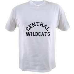
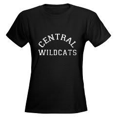
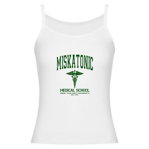
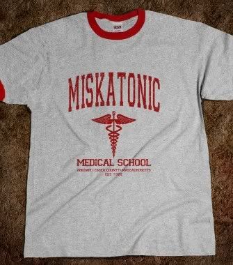
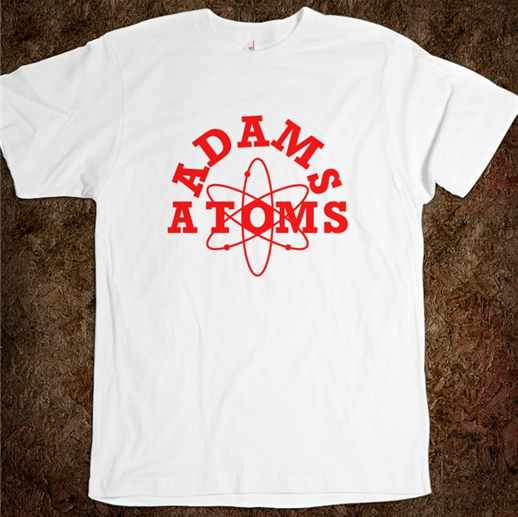
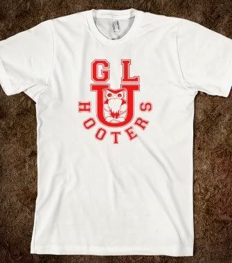
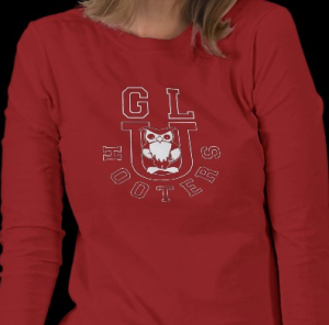
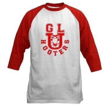
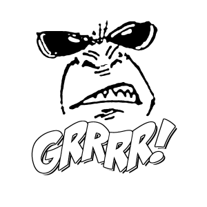
As the cliche goes, A picture is worth a 1000 words. To a t-shirt designer, a word can be worth a thousand dollars, in sales, that is. I’m talking about font and typography. As far as the Print On Demand business goes, most of my sales are derived from funny or ironic pop culture designs. Most are a mixture of images and texts. However, I have a few designs, that aren’t really what I would call designs. They are simply words on a shirt. But putting funny phrases on a shirt is nothing new or secretive. In fact, Thinkgeek has a simple black shirt with the word “meh” on it and it’s pretty funny because it hits that chord of discord among geeks and the younger, texting and Internet savvy generation.

Truth is, you don’t have to have a flashy, artsy-fartsy design to make a sale. Yeah, you may want it if you are indeed an artist, you may need it for credibility’s sake and if you have those kind of skills, I applaud you. If you don’t, you have to go with what works. For me, I have a novice to medium amount of artistry skills which could rival a third grader’s macaroni art. My success with selling graphical tees is a product of paint program trickery. But, I’ve also complimented those designs with a slew of text designs to help out in the balance sheet.

Don't get excited just yet. You may have the funniest g’dam sense of humor in the world and can bring the entire room to tears with a simple utterance of a word like, "Bazinga," but there is no voice attached to your shirt. Just like telling a joke, it’s all in the delivery. That’s why you need to really think about how to properly put words on a shirt.

First off, know your typefaces. There are more than 1001 fonts out there and if you use them correctly, you could have a great seller on your hands. If you think Comic Sans is the end all, be all of fonts, to use on a shirt, you could get the oversized hook, yanking you off the stage. Study up on typography and see how attention to typograpgy can make your words jump off the page, or shirt as it were. Choosing a font or style of font is part of the battle. What about the letters themselves? Is it something that looks better in all caps or does it need to have some distinction between the beginning and the rest of the word? Maybe your text reads well in all caps but would look better if you made the first letter bigger. If you can't come up with your own fonts, you can find a slew of them on the Interent. Some free. Some for money. But before you start loading up your font folder on your computer do you have the right to use those fonts for commercial purposes? People who come up with font designs are very talented and you should respect their work by reading all the fine print.

Second of all, a word, by itself, is nice, but if you can do some extra trickery to it, it might become more interesting of a design. Now you're thinking, "Ok, wait a minute. we’ve stepped away from just working with text and are getting into designing, right?" Not necessarily. Just look at the text on your design and think if there are any other touches you could use that would help set you apart from the other designers out there. Open up an application like Microsoft Word and try WordArt to give you some definition or diversity. Look at your Graphic Editing Application like Photoshop or Paint.Net to see what features they have for text on a design. Maybe some shadows or three dimensional use helps. What about arching the text or slanting it or think of other ways to display the word. Then again, it just might look good sitting there in the middle of the shirt like “meh.” In any case, never be satisfied with a design until you’ve given other options a chance. Don't get wrapped around the axle, though, because sometimes less is more. Still, when you go with style over substance, you usually win in the end.

Also, throw a splash of some other elements into the design. Creating a picture out of words could be nice or maybe you could add some touches to your font to make it look aged or different. Outlines and gradients can also help. For me, black text on a shirt is ok, but if you really want someone to read your shirt, simple words will not grab their attention. The same goes for people buying your shirts.

I personally like typewriter fonts. One of my personal favorites instances of a typewriter font in use is Cheap Trick. Their album covers have that sort of bleeding edge look where the ink kind of runs on the page. But typewriter fonts are a little over done in shirt designs so I like to add some other elements like droplets of ink or smudges to the page. It’s a fairly simple, or Cheap Trick [wink, finger guns, mouth clicking] And doesn't take that long to do. Take a look at the two images below.

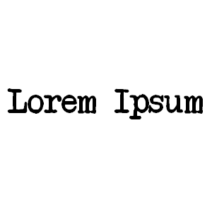
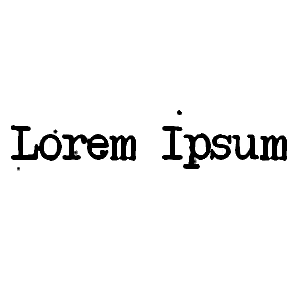
The first image is simply the words, Lorem Ipsum, as they are typed out in a typewriter style font in Paint.NET. The second image is the same as the original, but I added some ink droplets by combining added noise with outlining of objects. Depending on the theme or subject of your design you may want to convey a sloppy or erratic style of text. In a future post I will demonstrate how I achieved the look. It may take a few steps, but if anything, you could save yourself from having to buy the rights to a font that already has this feature baked into it. Instead, you can use a free to use font and add the elements in afterwords, creating the same effect.
This is just one example of how to experiment with your designs. You are only limited by your imagination. Chances are your simple word or phrase would probably sell on its own, but when one or more other designers are already established with similar looking images, you need to set yourself apart. It may be the difference between their single word on a shirt or your flashy design that happens to look like a word. In any case, you gain experience, ability, more importantly, sales.

Font on!


Font and Typography Websites
1001 Fonts
Dafont
Fontspace

Peer Links
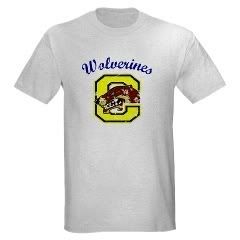
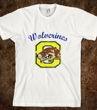
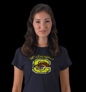
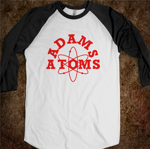
250 Beautiful Typography Shirts